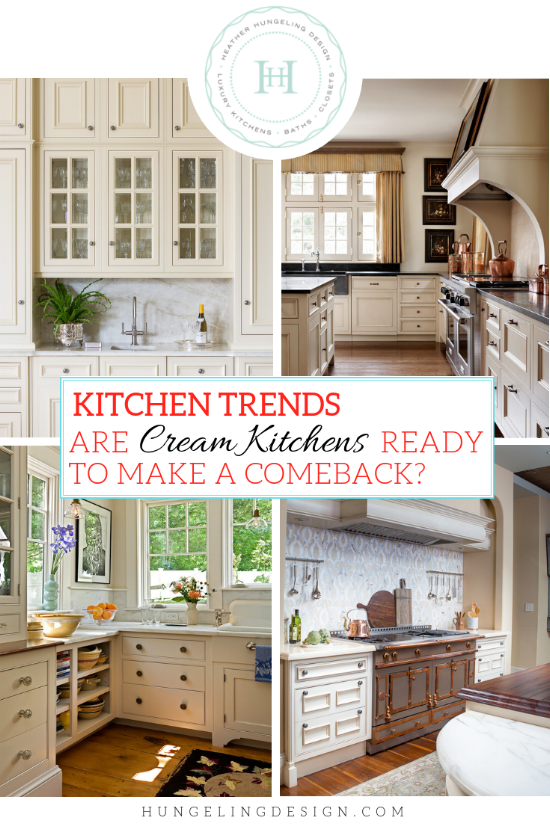
What To Do When You Secretly Love Cream Kitchen Cabinets
Do you hold on to images of kitchens designed 15 years ago and sigh wistfully at the beautiful cream kitchen cabinets? Do you put up with the smirks from your trendier friends when you choose warm colors that aren’t exactly en vogue right now? Even if you are perfectly comfortable shaking off the trends and marching to the beat of your own drum, it can still be hard to go against the grain when it comes to decorating your home. But I have good news for lovers of cream everywhere…I’m forecasting a return of the warmer, creamier colors of our past!
Are Cream Kitchen Cabinets Poised for a Comeback?
Source: Atlanta Homes & Lifestyle Magazine
THE LIFE CYCLE OF THE TREND
Significant shifts in color palettes cycle around about every ten years or so. In the early 2000’s, it was all about brown. Beige carpet, brown furniture, fabrics with burnt sienna and gold, etc. Then the grey trend arrived somewhere around 2010. We’ve all been living that out for the past eight years, and now we’re seeing it’s gradual demise. Trends don’t rise and fall in a fortnight. Rather, the pendulum makes a slow and relatively predictable swing in the other direction, which is what’s happening now. The shift from cooler grays to warmer greiges (brownish grays - but still predominantly gray) has been occurring over the last couple of years. Now the design world is starting to ramp it up to “mushroom” tones, which I would classify as leaning more brown than gray. At the same time, I also believe we’re working our way towards cream again - simply because it plays so nicely with the other colors stepping into the limelight. Notice the mushroom cabinetry in the image below? Then look again, and you’ll notice the designer has chosen a lovely pale cream color for the walls!
Source: Country Living
THE FAITHFUL DEVOTEES OF CREAM KITCHEN CABINETS
For years, I yearned for more bright white kitchens to fill out my portfolio, but almost all of my projects were some shade of cream. In fact, I was beginning to feel like the Queen of Cream. Don’t get me wrong, I still loved cream kitchen cabinets, even then. However, I thought that if I had more white kitchens to show, it would be more beneficial to my business. Then one day (not that long ago actually) it dawned on me why I didn’t get more client requests for white kitchens…my client base is almost entirely made up of people that fall into one of these two groups:
1) Warm Luxury
Very affluent consumers in the home design industry are a bit of an anomaly in the context of the trend life cycle. They usually don’t follow along with the predictable trend patterns quite as often. While I was chatting with a colleague the other day (who also has an extremely high-end client base), this subject came up. We were both sharing how cream kitchen cabinets have never really lost steam with our particular clients. This fact is also evident in the business world of soft furnishings. Higher-end showrooms will generally feature more creams out of deference to this market. That was particularly true at High Point this year as the warmer colors have started to pick up steam. So why are these luxury consumers so in love with their cream kitchens?
While I believe that cool luxury is every bit as valid as warm luxury, I think that warm luxury is simply more relate-able to the luxury market. It’s the high calorie, richer cousin of white. Take for example the kitchen below. If this kitchen were white, it would still be beautiful, but it would also have a crisp and stately presence. However, the rich cream color allows the space to convey serenity and quiet sophistication, which nicely sums up this particular client’s design aesthetic.
Source: Heather Hungeling Design | Wentworth Place Project
2) Warm Traditionalists
There’s also another segment of the design market which has always been faithful to cream as well. It is made up of people who would describe their dream kitchen as warm, inviting, and the heartbeat of their home. They may or may not have large budgets for construction and remodeling projects. Regardless, they crave a relaxed, intimate environment, and generally love traditional (even nostalgic) design. They appreciate texture and warmth and will seek those out wherever they can find them. If you want to depress someone like this, all you need to do is put something gray in front of them! Hmm…I think I just described myself.
Source: Atlanta Homes & Lifestyle Magazine
MAKING CREAM LOOK CURRENT
No one wants to go back to the world of builder-beige! Each time large shifts like this repeat themselves, there are always talented designers and influencers that craft a new spin on it. I think the creams in our immediate future will be fresher and kept on the lighter side. I think they will most often convey a soft, tranquil look. If you’re looking at colors for your kitchen cabinets, my specific recommendation for keeping it current is to choose a reasonably light cream color (relative to the other shades in the room) and paint your walls and trim the same color as the cabinetry. When selecting cream cabinetry twenty years ago, the tendency would have been to choose a darker beige or yellow color for the walls. If you do that now, you’ll instantly send your kitchen back in time by several decades. If you keep the color of your walls the same lighter choice as your cabinetry (but perhaps change the sheen a bit to differentiate), it will make the whole room feel more spacious and bright. Many of the kitchen images below follow this concept, but the image above illustrates this point particularly well.
Source: Atlanta Homes & Lifestyles
IDENTIFYING THE RIGHT COLOR FOR YOU
If you’re in the midst of selecting a color for a kitchen project, my best advice is to start by choosing your countertops, flooring, and backsplash tile before you pick a cabinet color. If you’re going with wood floors, that will make your life a little easier, however, selecting countertops and backsplash tile are haaaaaarrrrd. Everyone struggles with choosing these materials, and there are far fewer choices than there are paint colors in the world. So start with those major investment items first. If you fall in love with a particular marble or backsplash tile, that can be your jumping off point for the paint selection.
I’ve grouped some of my favorite creams into three categories, which I think reflect how most people would approach this kind of a decision. However, I encourage you to explore beyond the category to which you are initially drawn…because every room is different! The amount of natural light, the particular direction of sun exposure, reflective qualities of things outside your windows, existing colors, as well as fabrics can all play a significant role in determining how a paint color will look in your space. While I’ve used many of the paints below in my own projects, I almost never use the same color twice. There is simply no “one size fits all” answer to any paint project. So use the following paint guide, as well as the kitchen images below, as broad inspiration for creating your own dreamy kitchen.
It is also worth noting that creams, just like whites, have undertones which are very important to identify when you’re creating a color scheme. There are creams with grayish-green undertones, just like there are creams with pink or peach undertones. The only way to identify the undertones of a selected color is by comparing it to other colors. Hold a cream with lots of yellow up next to a cream with pink undertones and you’ll be able to see it immediately. Since I’m not a color specialist, I’m not going to go into a lot of depth on this topic. Rather, I will point you towards two bloggers who have made color selection their main gig in life. They have lots of great information on their websites that explain this far more succinctly than I can.
Maria Killam (A color specialist who offers e-books and design courses on color selection. I’ve been reading her blog for several years, and I highly recommend it.)
Kylie M. Interiors (I just discovered this designer’s blog, but I also highly recommend her as well. She has a lot of in-depth analysis and video reviews of specific popular colors from Benjamin Moore and Sherwin Williams)
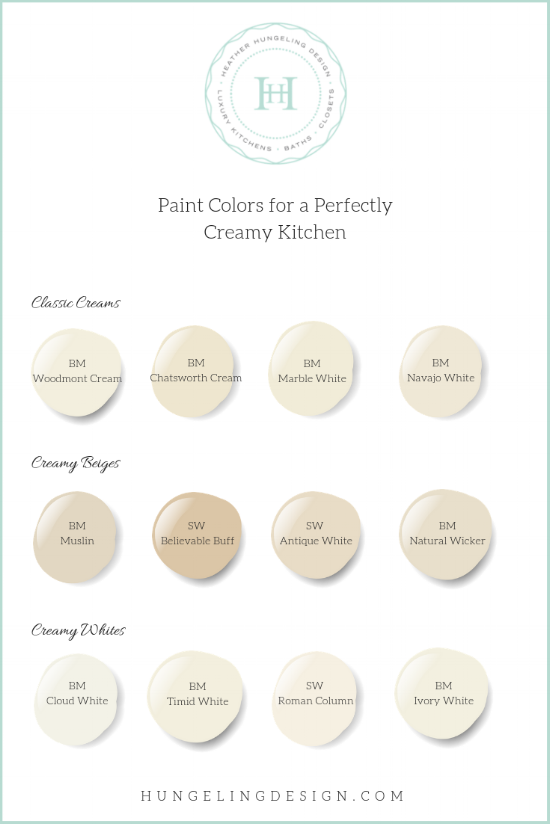
CLASSIC CREAM KITCHENS
When I think of a classic cream kitchen, it brings to mind a rich, butterfat cream. We may still be a way off from yellow-creams making a strong re-appearance, but I think the strong yellow undertones are lovely when used in the appropriate setting. They convey a more traditional and often nostalgic vibe. Combine a yellow-cream kitchen with details like plate racks and apron front sinks, and you have a sweet look that is perfect as long as that’s in keeping with the architectural character of your home.
Source: Heather Hungeling Design | Woodhill Avenue Project
Source: Casa Verde Designs via HomeBunch
Source: Murphy & Co
Source: BH&G
CREAMY BEIGES
This is the hardest color group of the three to envision from just a paint swatch. For instance, the cabinetry in the image below was painted Sherwin Williams “Believable Buff” (referenced in the chart earlier). I still have a hard time accepting that, even though I know it’s true! The color on the swatch looks so beige, but yet the cabinetry looks like pure, creamy perfection. This apparent contradiction goes to prove the point that when it comes to color, it’s all relative. Since the walls and trim are painted the same color as the cabinetry, there really isn’t anything particularly white which would make this color appear darker in contrast.
Source: Heather Hungeling Design | Wenthworth Place
Source: Heather Hungeling Design | Willow Lane Project
Source: Smith & Vansant Architects
Source: Andrew Ryan Design
CREAMY WHITES
For those who are just looking for something softer than the bright whites which have been so popular these past few years, try dipping your toe into the world of creams with one of these picks. Make sure you have plenty of natural light when choosing whites or creams. If you don’t, you’ll end up with a dingy cream, rather than a pretty one. Also, pay attention to the LRV (Light Reflectance Value) number in a paint color. LRV is a measurement of how much light is bounced around in the room for a particular color. With pure white measuring 100, the closer your number is to that, the brighter your color will feel in the room. You still need to have a good source of light to begin with - as this won’t “put” the light into your room. It’s merely a measurement of how well it reflects the light that you do have.
Source: Casa Verde Designs via HomeBunch
Source: Premier Custom-Built Cabinetry
Source: Julie Blanner


The final post in this series focuses on unique details that you can use on your cabinetry doors to infuse some needed character into your kitchen design.