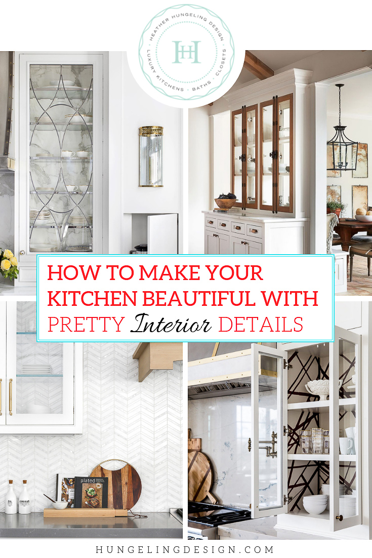
How to Make Your Kitchen Beautiful with Pretty Cabinet Details
PART 1 | FROM THE INSIDE OUT
If you’re reading this post, then you are probably really into the nitty-gritty details about kitchen design! Me too! But let’s just admit that this isn’t a topic that would get the average person excited. In fact, when I was telling my husband that my upcoming blog post was about kitchen cabinet details, I got that little “oh, Honey, you’re boring me to tears” look. Maybe you’re familiar with that look? But, hey…if you’re knee deep into a kitchen remodel project or designing a new home, then I don’t need to tell you just how much these details matter. Personally, I can leave no stone unturned when I’m working on my home or someone else’s. I literally feel like I need to explore every detail and investigate every available product so that I don’t have that day after remorse thing. The “oh, I wish I’d thought of that,” kind of remorse. That approach is pretty exhausting at times, but it tends to pay off big for me in the long run. So in the interest of thoroughly investigating design options to make your kitchen cabinetry the most beautiful cabinetry ever seen on planet earth, let’s begin with some interesting ideas and details for the interiors first.
(I’ve decided to break this up into a 3-part series, so look for the future two posts over the next several weeks.)
Interior Kitchen Cabinet Details That Deliver Major Wow Factor
OPEN, BACKLESS CABINETS
Let’s face it, open shelves look fabulous, but we’re not all cut out for it. I know we see it regularly on Pinterest and Instagram, but I’ve yet to have a client really follow through with the open-shelves thing. Sometimes we start out with it on a plan, but usually, the anxiety of maintaining the look of it outweighs the prettiness factor. So if you’re planning your new kitchen and you find yourself doing the same internal debating about open shelves vs. open cabinets, then consider the idea of an open, backless cabinet as a compromise. I think this is a natural companion to the open shelves trend because it maintains a similar light & airy feel. I also really love that it carries the pattern or texture of your backsplash tile up the wall, which brings a lot of continuity to the room. No more “a row of solid boxes hung on the wall” look!
The other really cool thing about this idea is that it can offer you an “out” down the road if you tire of having everything on constant display. You’ll just need to order a set of doors for those particular units, and you’ll be back to stashing whatever you want in there in no time.
Source: Heydt Designs
The key to this look is to have a beautiful backsplash tile that you don’t mind seeing A LOT of. The marble subway tile in the image above works great because it gives texture and pattern while still being a very neutral backdrop to all of the pretty little things on display. I recommend that you stick with a backsplash tile with a simple pattern & color. Although a dramatic tile may look great, it will be difficult to style the shelves without the whole thing looking too busy.
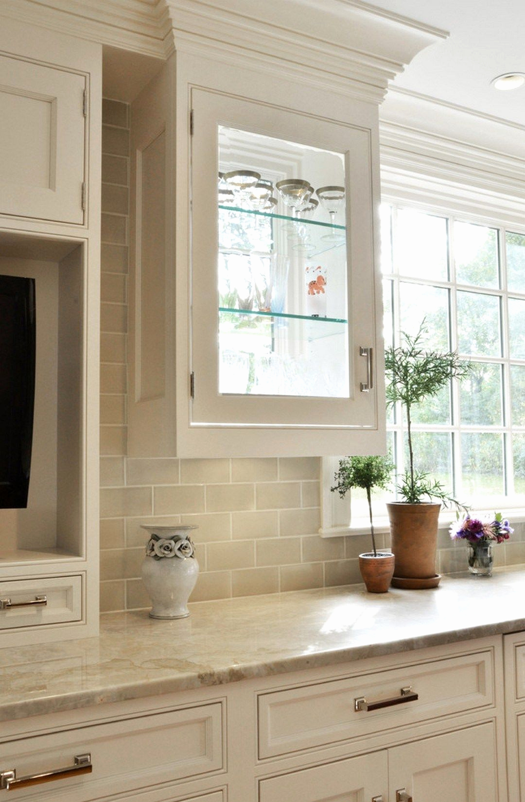
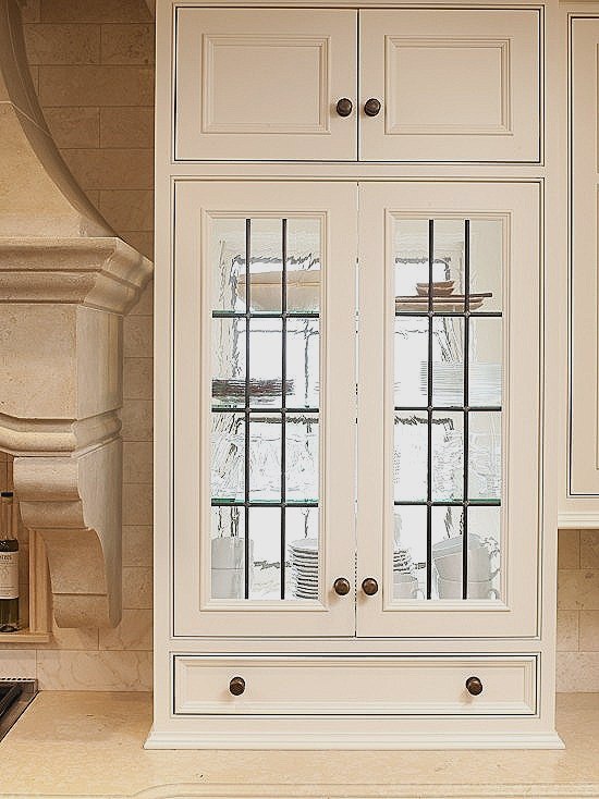
GLASS, BACKLESS CABINETS
The next three images show the most intriguing part of this idea to me…combining the lightness of open, floating shelves with the sparkle of glass cabinetry. You can tailor just how transparent you want the cabinet to be by choosing different types of glass. Leaded, antiqued, or smoked glass would obviously provide less transparency. However, even beveled glass can be combined with mullions to decrease how easily you can view the cabinet’s contents if you want a more forgiving look.
Source: Richard Anuszkiewicz via House Beautiful
In the stunning kitchen above, the designer created more privacy by using leaded glass, which is really beautiful in and of itself. However, your eye can still pick up the movement of the marble slab behind the glass door. It makes the inside of the cabinet as beautiful as the exterior!
Source: Lindye Galloway Interiors
In this more transitional kitchen above, the pattern of the tile makes a strong statement, while the color keeps it all light and fresh.
Source: Prairie Home Styling
The width of the cabinetry doors in the image above creates the greatest visibility out of these three photos, so keep that in mind as you are working with the layout. The wide glass doors in this instance almost make the cabinet seem to disappear on the wall. Your eye is drawn to the content of the cabinets and the pattern of the tile on the wall.
SEE-THROUGH CABINETS
The advantage is obvious here…tons of additional light without having to sacrifice cabinet space. However, you really need the right set-up to pull this off. The first thing that comes to mind for me is that while this may look very striking from the inside, it may look a bit odd if those windows faced the street. If your kitchen was configured so that the windows faced out to your private garden and could be landscaped in such a way as to balance the different heights of your windows, then this might work really well. I would also caution anyone considering this idea to think about precisely what they would want to store in these cabinets. With the sunlight coming in behind them, it will really highlight whatever you display…as well as dust.
Source: RLH Studio via DecorPad
While the particular glass cabinet door on the left makes the interior very visible, you could also use this idea and pair it with leaded glass doors (right image) or antiqued glass for more privacy.
PAINTED INTERIORS
This is such a simple way to introduce an accent color into your kitchen. This has a sentimental feel to it, while at the same time being fresh and modern. The more subtle your color, the better.
BH&G via DecorPad
There are many colors that you could use as an accent, but a pale bluish-green is always my favorite and pairs very well with white/cream cabinetry, and marble countertops. This look conjures up images of Southern porches with their “Haint Blue” beadboard ceilings.
Source: Humphrey Munson
Of course, it is also lovely to have the interior be a creamy white while the exterior is another color!

Source: Whittney Parkinson Design
Although the image above isn’t a kitchen, I wanted to include it because I just love what the designer did in this mudroom. I’ve always wanted to experiment with doing a horizontal shiplap inside of a cabinet before, but this designer knocked it out of the park by also painting it a beautiful forest green.
BEADBOARD - CONTRASTING WOOD TONE
A slightly more English look nowadays is to use a contrasting wood feature inside of your upper cabinetry. Walnut beadboard looks smashing against a crisp white kitchen. You can do this in an open cabinet (image below) or do it behind glass doors. So many of the little pretty things we like to display tend to be white-ish in nature, so having a darker background helps them to really stand out.
Shor Home via DecorPad
DOUBLE SIDED CABINETS
While it is tricky for a manufacturer to make a double-sided wall cabinet, they offer great light and visibility in certain situations. I have most often seen them used to flank a pass-thru or peninsula between a breakfast room and a kitchen when trying to maintain some light or a line of sight between the two areas.
Source: Magnolia
I absolutely love what Joanna Gaines did in the image above. She wanted to maintain the open feel between the kitchen and breakfast table, but they needed some sort of architectural separation because the line of the vaulted ceiling ended between the two areas. I thought this was a clever way to employ the idea while still making it look and feel like a piece of furniture.
WALLPAPER
This option doesn’t really need much explaining…just admiring. However, I do want to point out that I think restraint is the trick to making this look classy. In each of the examples below, only 2-4 cabinets in each kitchen are given this special feature.
Source: Studio McGee
In the image above, the designer just used the texture (grasscloth) on the back of the cabinet for a subtle, but tailored look.
Source: Alice Lane Home via Ivory Lane
In this kitchen, the designer wrapped the whole cabinet interior with a Kelly Wearstler wallpaper, which makes a fun, graphic statement on either side of the range.
Source: Pink Peonies
This last kitchen image uses a chevron pattern for a unique look as well. Again, notice that only two cupboards are accented with this material.
Well, there you have it. Most (but never all) of my ideas of how to make your cabinet interiors a bit more special. I believe that this is a trending concept right now and will be so for a long time as our expectations about our kitchens continue to evolve. At the high end of the market, my clients are looking more and more at luxury finishes for their cabinet interiors. I do very few kitchens or bathrooms with the typical birch-ply interiors anymore. Clive Christian, as well as other upscale brands like Christopher Peacock and Smallbone are selling premium walnut and oak interiors and drawer boxes as custom features of their bespoke kitchens. Clive even offers gorgeous marquetry inlay and burl veneers for their interiors. Why? Because we continue to ask for more from our kitchens with every passing year. We want them to exude the kind of warmth and comfort that we expect from any other room in our home, so it’s only natural that the idea of kitchen cabinetry will evolve to fit that bill.
Tune in next week for Part 2 of How to Make Your Kitchen Beautiful with Pretty Cabinet Details…on the outside.


Break out of the “boring white kitchen” syndrome with these tips on using glass cabinetry to create stunning character and visual interest in your next kitchen. Think beyond the old idea of using glass wall cabinetry to flank a window and learn how to create dramatic glass features that will give your kitchen more personality.